
For personal brands
Presence
Ready to be seen and trusted.
Explore PresenceVERA CREATIVE PARTNERS · BRAND AGENCY
The brand agency that turns your vision
into a world people connect with.
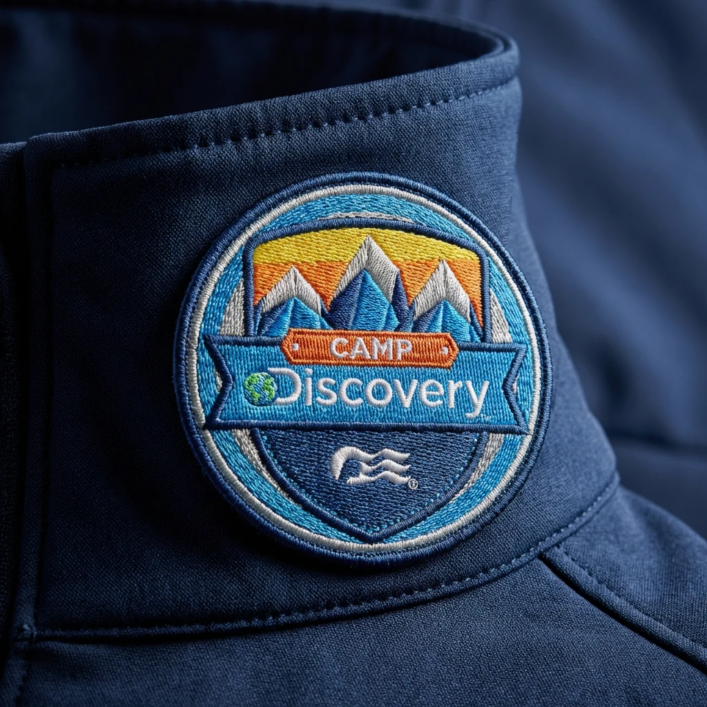
Director Leia Mariano · Cinematography Storytravelers x Hello Emilie · For Princess Cruises
What we do
From the first clear idea to the pieces your team needs next, we bring your brand together, and help it keep growing.
Bring your logo, visuals, and everyday touchpoints into one recognizable world.

Create a digital experience that makes your value clear and the next step feel natural.

Let packaging, publications, and print carry the same care as the work inside.

Keep campaigns, presentations, publications, and collateral connected as your needs grow.

Portfolio
We translate the vision you started with into a brand that stays true and holds its own, from strategy and story to every place it shows up.
Across the work
Ways to partner
A focused beginning, a stronger presence, or a new chapter. Find the partnership that meets you where you are.
For personal brands
Ready to be seen and trusted.
Explore PresenceFor growing businesses


Ready to bring everything together.
Explore MomentumFor established organizations

Ready for the next chapter.
Explore LegacyWhat Becomes Possible
Help the right people recognize themselves in your brand.
Make the care and quality behind your work easier to understand.
Create a cohesive first impression that earns confidence.
Build recognition and consistency as your business evolves.

Your Creative Partners
Our partners remain directly embedded in the work from day one. We shape the strategy, direct the creative, and protect your vision straight through to launch.
We keep our client roster intentionally select so every brand we touch receives our full focus and thoughtful care.
Meet the foundersIn Their Words / Client Perspectives
“Somehow, they took all of the ideas in our heads and brought them to life even better than we imagined!”
“Their biggest problem is probably their perfectionism. They actually care about my mission and learned as much as they could what was so important to me.”
“New product line logo and magazine, both projects were done with a high, unique design level of expertise.”
Delivered monthly
From the desks of the directors at Vera.
The work, the people behind it, and what's inspiring us lately.
From

Portfolio
Brand identities, digital systems, and editorial platforms built for lasting market presence.
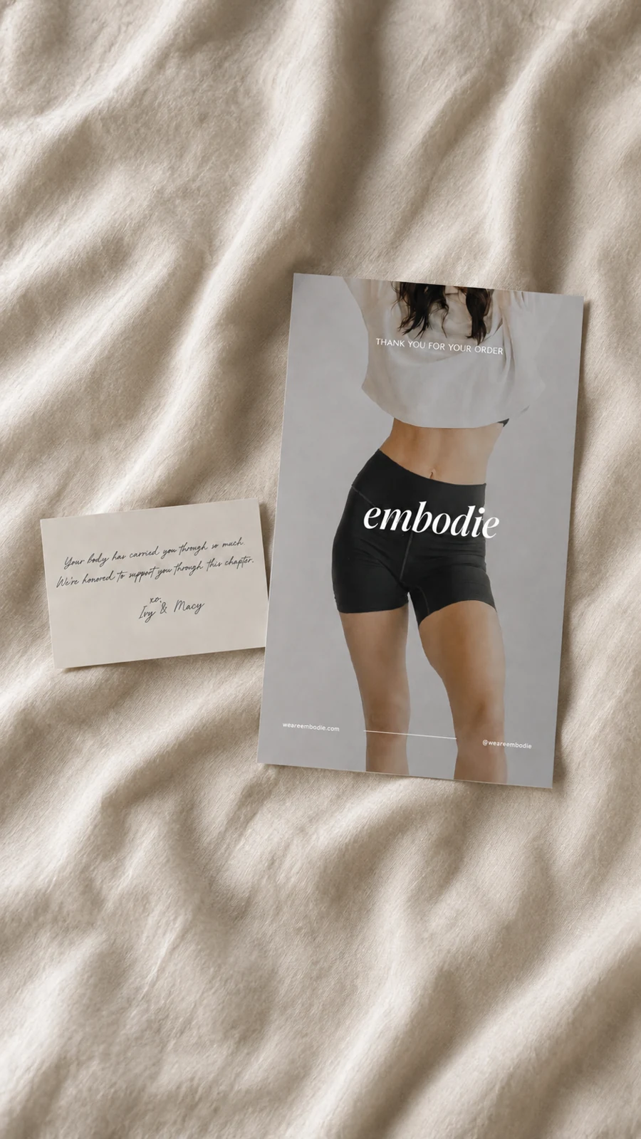
I want to explore my optionsClient / Embodie
“Can you help us establish a new standard for postpartum supportwear with an elevated, aspirational brand that redefines the category?”
Client / Rebel Ninja
“I’ve spent years helping kids build confidence through Kung Fu and play. Can you help me turn that into one Rebel Ninja world, with something for kids, teens, and parents?”

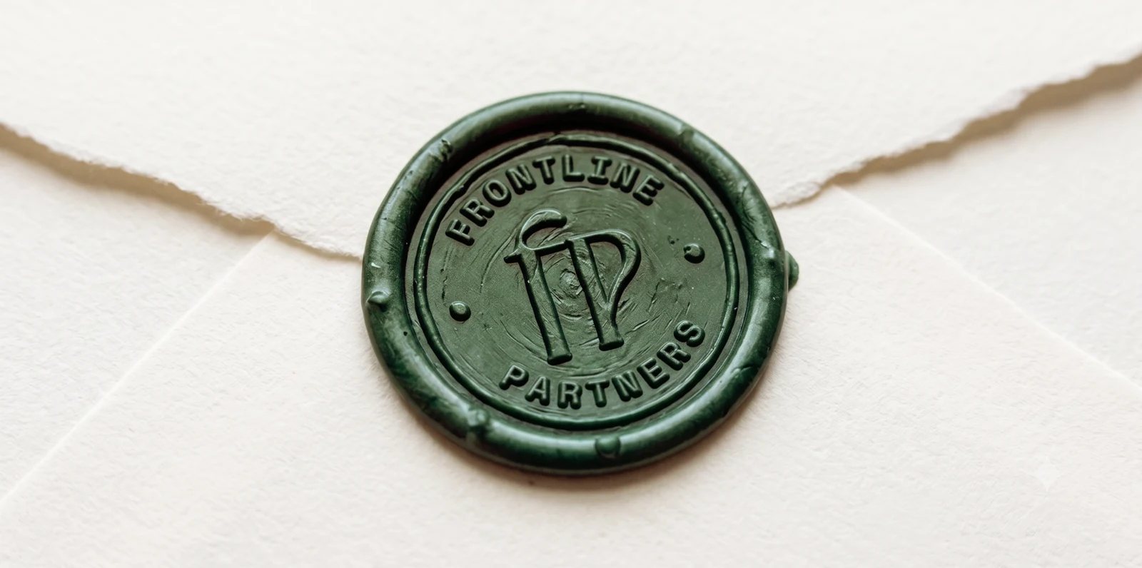
Client / Frontline Partners
Our existing branding needs to feel less institutional and more relational, and visually communicate: “You’re not a donor—you’re family standing with the persecuted church.”
Beyond the case studies
In Their Words
“Somehow, they took all of the ideas in our heads and brought them to life even better than we imagined!”
“Their biggest problem is probably their perfectionism. They actually care about my mission and learned as much as they could what was so important to me.”
“New product line logo and magazine, both projects were done with a high, unique design level of expertise.”
From Our Founders

Between us, we've spent more than two decades building brands for global names and first-time founders. We've seen what happens when a clear vision passes through too many opinions, or gets dressed in a trend that was never its own. By the time it reaches the world, the part that mattered most can feel lost.
We started Vera to protect the first spark. We stay close enough to hear what you mean before you've found the words, and we keep listening as the idea takes shape. Sometimes the best part of the work surfaces in a passing message, a new question, or a turn none of us saw coming.
Be as involved as you'd like, or step back and let it take shape. We can't wait to see what you're building.
Leadership
Creative Director
Leia has spent more than two decades helping brands find their voice and bring it to life across hospitality, entertainment, consumer brands, and wellness. She loves getting to the heart of an idea, then finding the right words and visuals to make it feel unmistakably yours. At Vera, she leads creative direction with a thoughtful eye and a belief that every detail should earn its place.
Director of Strategy
Jay comes from a world of storytelling, games, and experience design, so he’s always thinking about how the pieces fit together. He asks the questions that help you see what makes your business different, who it’s for, and where it can go next. At Vera, he leads strategy, giving every creative decision a clear purpose and keeping the bigger picture in view.
The Vera Ethos
Our prescription for the work: protect what matters, find the clarity, and give it form.
Keep the conviction that started it all at the center. Let it guide what you say, what you make, and how you grow.
Get clear on what you mean before deciding how it should look. A visual identity is stronger when it has something true to express.
Give people something to recognize and return to. Build from your own point of view instead of the latest trend.
Create a foundation your team can carry into every touchpoint. Make consistency easier as the work grows.
Give the vision in your head a form others can understand, trust, and step into.
Our directors have led work for
In Their Words
“Somehow, they took all of the ideas in our heads and brought them to life even better than we imagined!”
“Their biggest problem is probably their perfectionism. They actually care about my mission and learned as much as they could what was so important to me.”
“New product line logo and magazine, both projects were done with a high, unique design level of expertise.”
Stay connected
Ways to Partner
Brand partnerships for personal brands, growing businesses, and established organizations. Strategic clarity when you need direction, and ongoing support as your brand grows.
I want to explore my optionsPersonal brands
Make your expertise easier to see and trust. Bring your voice, identity, and website together so the right people understand what you offer.
4–6 weeks
Essential messaging & positioning
Wordmark, color palette, and typography
Focused responsive website
One page, up to 5 sections, or 3 focused pages: Home, About, Offer / Contact.Concise brand guide
Brand applications and collateral are not included.Growing businesses
Give a growing business a coherent presence. Connect your positioning, identity, website, and brand applications as you reach more people.
8–12 weeks
Strategy workshops & competitive positioning
Complete visual identity system
Custom website, up to 5 pages
Brand applications, such as packaging, flyers, and other agreed collateral, plus brand guidelines.
Established organizations
Bring an established organization into its next chapter. Align your leadership, clarify your brand architecture, and build an identity your teams can carry forward.
12–20+ weeks
Leadership alignment, audience research, multi-brand architecture & positioning
Comprehensive visual identity system
Digital / website development scoped separately
Rollout support
Vera Advisory
For brands that don't need a visual redesign, just high-level clarity on positioning, messaging, and narrative.
Audit my brandTiming: 2 weeksWhat we focus on
100% of your investment is credited toward a full partnership if you decide to execute a design build with us down the line.
What Becomes Possible
A clear point of view helps the right people recognize themselves in what you are building.
A cohesive brand signals intention, credibility, and care before anyone ever speaks with you.
When your brand reflects the care and ambition behind your work, people see its value more clearly, and feel more confident choosing you and investing in what you offer.
A clear system gives every new offer, campaign, touchpoint, and idea one recognizable place to grow from.
For brands we know by heart
As your brand grows, new needs emerge: a campaign, a presentation, a website update. We build on the strategy and identity we’ve already shaped together, so each new piece belongs, and you don’t have to brief a new team from scratch.
Direct collateral, presentation decks, and digital site updates.
Explore Essential SupportMonthly creative direction, campaign design, and continuous brand development.
Explore Strategic StewardshipFAQ
No. Knowing what you want to change is enough to begin. We’ll help sharpen the rest.
Yes. When there is equity worth keeping, we find what should stay and what needs to catch up.
Yes. Presence, Momentum, and Legacy all include strategy and messaging at a depth suited to your brand. The words and visual world should come from the same idea.
Essential Support and Strategic Stewardship build on the brand we have shaped together. Explore ongoing support.
Presence gives a personal brand a focused identity and website. Momentum connects a growing business’s strategy, identity, website, and applications. Legacy supports established organizations with leadership alignment, brand architecture, and a comprehensive identity. We’ll help you find the right fit in our first conversation.
Vera Advisory is a two-week engagement focused on your positioning, messaging, and strategic priorities. You leave with an actionable roadmap, whether your next step is refinement or a fuller brand build.
Presence includes a focused responsive website, and Momentum includes a custom website of up to five pages. Digital and website development for Legacy are scoped separately around the organization’s needs.
Presence typically takes 4–6 weeks, Momentum 8–12 weeks, and Legacy 12–20+ weeks. Vera Advisory takes two weeks. We agree on the schedule around the scope, content, and availability of the people involved.
Bring what you have: your goals, existing brand materials, website, audience insights, and any ideas or concerns. It helps to know who will make decisions and who needs to be involved. You don’t need to have every answer before we talk.
Yes. Our directors lead the work from strategy through creative direction. You have a direct relationship with the people shaping your brand and space to share context, ask questions, and give feedback.
Yes. Vera is based in Southern California and partners worldwide. We coordinate conversations, reviews, and feedback remotely, with a working rhythm agreed around your team.
Tell us what you need and where your brand stands today. We’ll discuss whether it fits a focused engagement, a broader partnership, or ongoing support for a brand we’ve already built together.
In Their Words
“Somehow, they took all of the ideas in our heads and brought them to life even better than we imagined!”
“Their biggest problem is probably their perfectionism. They actually care about my mission and learned as much as they could what was so important to me.”
“New product line logo and magazine, both projects were done with a high, unique design level of expertise.”
Start a Conversation
Bring the idea, the challenge, or the early framework. Let us start with a direct conversation.
Write to us
Share as much or as little as you have. A starting thought is enough for a conversation.
If you’d rather talk than fill out a form, we’d love to hear what you’re working on.
Book a call insteadStay connected
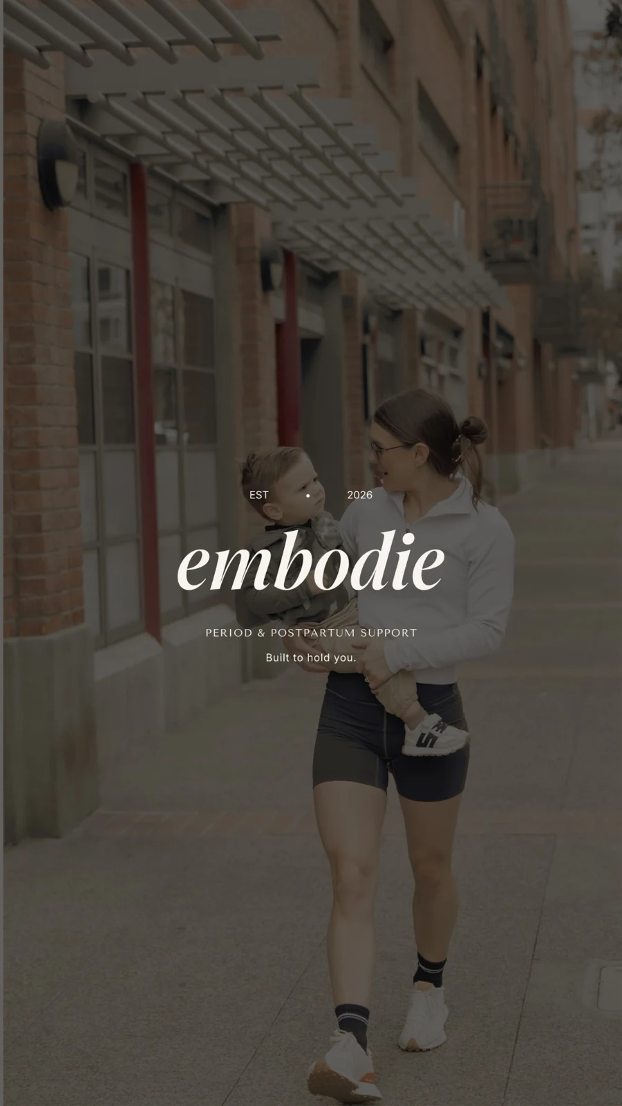
A strategy, identity, and packaging system for postpartum supportwear that brings clinical credibility and considered apparel together.


The First Conversation
We love our brand. Can you help us see what’s missing?
After two years developing their product and identity, Embodie’s founders loved their brand’s direction but felt something was missing. They asked us to help it feel as polished and considered as their vision.
Their science-backed postpartum garment bridged clinical care and fashion. Medical branding felt too cold; fashion alone couldn’t convey the evidence behind it. They needed help finding Embodie’s place between them.
The Approach
We researched the postpartum and maternity market alongside luxury fashion, looking for the gaps between clinical authority and desirable apparel. We combined those findings with the founders’ desired look and feel to develop a wide range of creative directions.
We explored technology and performance, everyday maternal warmth, and aspirational athleticism. Each direction included logo and typography explorations, with the wordmark shaping the wider type system. The range gave the founders room to test unfamiliar possibilities alongside a direction close to the identity they had lived with for two years.
That exploration confirmed what they felt most connected to: the spirit of their original brand. We rebuilt the wordmark using a different typeface, refining it into a cleaner, more polished, scalable identity while preserving its familiar character.
The final direction is premium and structured, with a soft, approachable side. Imagery, color, typography, and tone of voice work together to balance scientific credibility with maternal warmth.


The Color System
What We Delivered
We defined the mission, positioning, four strategic pillars, and six audience profiles, from new mothers to athletes and women in perimenopause. A founder story, elevator pitch, and word bank gave the team language centered on restoration rather than “bouncing back.”
The voice balances expert knowledge with personal care. The cocoon became its central idea: quiet protection through a period of change.

A fine italic wordmark and compact “em” emblem anchor the identity. Warm white, linen, and charcoal lead the palette, with gold used sparingly. Four typefaces have distinct roles, supported by contrast-tested pairings and photography direction centered on natural light and real bodies.


Brand guidelines
The brand guidelines bring Embodie’s strategy, identity, color, typography, voice, photography, and applications into one practical system for the team.
62 pages / A foundation to build on


The Outcome
The founders’ original conviction now has a more polished expression: a refined wordmark and a cohesive visual and verbal system that holds scientific authority and softness together.
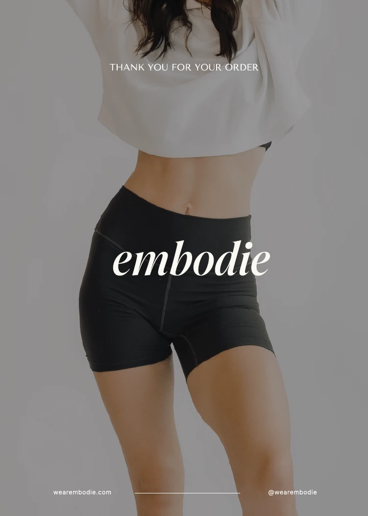
We extended that foundation into a co-branded storyline, welcome packaging, interface design, motion, business cards, email signatures, and social templates. Editable templates give the team a consistent foundation for future work.

In Their Words
EmbodieLeia and Jay were amazing to work with! They helped us with everything from our branding and logo to our packaging design, social media templates, and brand guidelines. The entire process felt seamless and professional, and they truly went above and beyond for us.
They really took the time to understand our brand, our vision, and what we wanted everything to feel like. Somehow, they took all of the ideas in our heads and brought them to life even better than we imagined! They were creative, thoughtful, easy to communicate with, and made the whole experience so enjoyable.
We couldn’t be happier with how everything turned out. If I could give 10 stars, I would! Thank you so much, Vera, we are so grateful for you!
Next Case Study
Giving Rebel Ninja a Brand Strategy That Scales
We turned Andrew’s ideas into a connected brand system for kids, teens, and parents, bringing strategy, naming, messaging, identity, and a digital world into one recognizable Rebel Ninja.


The First Conversation
One brand. Three audiences. How do we make it all make sense?
Andrew came to us with a wealth of ideas and a need for structure. Kids were his main audience, parents were the buyers, and teenagers needed a way in too. The challenge was to organize those ideas so each group could immediately recognize what was for them.
The Approach
We brought Andrew’s ideas into one coherent framework, connecting strategy, audience positioning, brand architecture, naming, copywriting, and design so each audience could recognize its way into Rebel Ninja.
Architecture
One recognizable master brand houses three sub-brands, each with a distinct role, name, color, and voice.
Recognition
Teal, purple, and pink make the audience clear at a glance. The Rebel Ninja identity holds the system together.
Program naming / Voice & messaging
We named Andrew’s coaching program to connect the promise of confidence with his game-based method. The name gives the program a distinct identity within the Rebel Ninja world.
We shaped the surrounding language to help families understand the offer, choose their path, and know where to begin.

In the real world
Rebel Ninja Teal gives physical assets a bright, recognizable presence.
Inside the digital world
In the app and website, Midnight Blue is the environment teal lives on: an immersive world to enter, play in, and explore.
The Color System
Website
We carried the brand architecture into the website itself. Kids, teens, and parents enter through different pages, each shaped around what they need to understand, feel, and do next.


What We Delivered
The master brand gives Rebel Ninja a strong, recognizable identity. Three audience-specific names and colors bring structure to the offer: teal for Rebel Ninja TV, pink for the Parent Series, and purple for Uncut. Each path feels distinct while belonging to the same brand.
The voice adapts too: playful encouragement for kids, warm guidance for parents, and direct language for teens. The shared conviction holds it together: “Confidence isn’t something you’re born with, it’s something you build.”

One master brand

Kids / Rebel Ninja TV
Confidence becomes approachable through games, challenges, and achievable wins.
“You’ve got this. Level up!”


Teens / Rebel Ninja Uncut
A channel system that respects teens, with real language and confidence without the cringe.
“No filters. Just skills that stick.”
YouTube vlogs
Coming soon
Parents / Parent Series
Clear explanations and practical tools that help parents support their children.
“Here’s how confidence gets built.”

On Spotify
The Rebel Ninja Parent Series brings Coach Andrew’s warm, straight-talking guidance to Spotify. We gave the podcast a distinct identity that carries the Rebel Ninja world into parents’ everyday listening.
Rebel Ninja Parent Series · Podcast identity
Brand guidelines
A 53-page guide brings the strategy, identity, audience architecture, voice, and visual system together, giving the team a foundation for everything they create next.
53 pages / One connected system


The Outcome
An 8-bit identity combines a pixel ninja icon, voxel wordmark, and flat logo variants. Midnight and Rebel Teal lead, with yellow and pink accents. Press Start 2P and Silkscreen provide arcade character; Consolas supports longer reading. Icons use a 16×16 grid, and photography captures real kids in motion.
Each channel received profile images, responsive banners, and thumbnail templates. A Figma podcast template and social formats extend the system. Stepped motion and a chiptune sting reinforce the identity, while the website gives each audience its own path, including missions, EXP, and an incoming call from Andrew.
Brand strategy, audience positioning, architecture, and coaching program naming.
Master logo and sub-brand suite, color, typography, pixel icons, and 53-page guidelines.
Voice, messaging, copywriting, YouTube branding, podcast and social templates, motion and sound direction.
Website design and audience pathways, carrying the brand world into the digital experience.
In Their Words
Rebel NinjaTheir biggest problem is probably their perfectionism. They actually care about my mission and learned as much as they could what was so important to me. I've mostly been doing a lot of my creatives on my own on platforms like Canva but after I shared with them everything I was looking for, they took it to heights I didn't know was even possible. I could have never been able to imagine nor create everything they have done for the Rebel Ninja brand. I am ever so thankful and will shout from the rooftops about these guys. Thank you so much ❤️

Next Case Study
Making Giving Feel Like Family
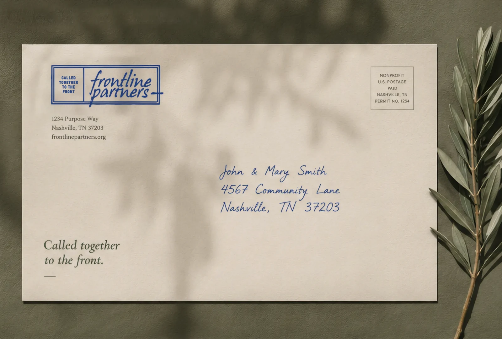
Frontline Partners wanted supporters to feel like family. We created a warm identity and a modular journal system that bring stories closer and give the team a consistent foundation for every new issue.
The First Conversation
The Vision
Our existing branding needs to feel less institutional and more relational, and visually communicate: “You’re not a donor—you’re family standing with the persecuted church.”
The Approach
We started with what Frontline Partners refused to be: one more donate button.
Online giving has taught people to expect the look of a bank. It’s clean, efficient, and forgettable, with generosity reduced to a confirmation number. The alternative is often the opposite extreme, heavy with urgency and light on dignity. Sterile or sensational, rarely human.
So we reached for the tactile over the techy: textures you could almost touch, marks that look made by hand, and a brand that feels less like a platform and more like a letter from someone you love.


What We Delivered
Frontline Partners now looks like what it is, a family, not a fund.
The identity began with the logo. We explored how a mark could carry warmth, witness, and the feeling of something passed hand to hand. The family-tree-inspired stamp held family, lineage, connection, and permanence in one mark. Paired with the literary wordmark and grounded color system, it gave the team an identity that feels personal without becoming institutional, with starter guidelines to carry it from day one.


The Color System
The Outcome
Then we gave that identity a place to tell its stories. The Frontline Journal is a quarterly publication built entirely on the brand we’d made. Cormorant Garamond gives headlines their gravity. Crimson Text holds the testimonies and the prayers, the words meant to be read slowly. A handwritten face appears only when a human voice needs to break through the page. The cover gives GCR and Frontline Partners each their rightful place.
And we made it theirs to keep. Beneath every spread sits a modular system of parent pages, so the team can choose a layout rather than design one. A visual layout menu shows every option at a glance. A guidelines document walks through building a new issue, step by step. We delivered it clean and imageless, a frame waiting for the next story, with one extra cover they didn’t ask for, because someday they’ll need it.
It’s a brand that reminds every supporter they aren’t just sending something. They’re part of someone’s family.


In Their Words
“New product line logo and magazine, both projects were done with a high, unique design level of expertise.”Global Christian Relief
Some photography featured in this case study is courtesy of Global Christian Relief, and some imagery is sourced from unsplash.com. All imagery is shown here for portfolio presentation only.
Next Case Study
Making Postpartum Support Feel as Coveted as Fashion
Services / Brand strategy
Turn a vision full of possibility into a direction you can stand behind. We help you find the meaning, position, and language that make your brand easier to understand, and harder to overlook.
I want to explore my optionsSouthern California · Partnering worldwide
What becomes possible
You may have a strong idea, a growing business, or years of experience behind you. But when your story changes depending on who is telling it, the next decision becomes harder than it needs to be. Brand strategy gives your team a shared foundation: who you serve, what makes you distinctive, and why people should care.
The work behind it
Every engagement is tailored to the work your brand needs. We agree the deliverables and scope before we begin.
Understand the people you want to reach, the context you compete in, and the place your brand can credibly own.
Bring your offerings, programs, or audiences into a structure people can navigate without losing the bigger story.
Shape the core story, key messages, and voice that help your team communicate with clarity and consistency.
In practice
How we work
Leia and Jay stay directly involved, connecting strategy and creative direction throughout the work.
We begin with your vision, your business, and the questions you have not quite been able to name.
Research and conversation reveal the connections between what matters to you and what matters to your audience.
We translate the strategy into a practical foundation for your identity, website, and future communication.
A few things you might be wondering
A logo identifies your business, but it cannot answer every question about your audience, positioning, or offer. We can build on what is working and identify the strategic gaps before recommending changes.
Yes. Brand architecture helps clarify how your offers and audiences fit together. Rebel Ninja shows how one brand can create distinct entry points for kids, teens, and parents.
The strategy can guide identity, messaging, website, and collateral work. We will recommend the partnership and sequence that fit the next stage of your business.
Services / Brand identity & design
Give people a way to recognize what they already feel in your vision. We turn your brand’s meaning into an identity that feels considered, distinctive, and connected wherever it appears.
I want to explore my optionsSouthern California · Partnering worldwide
What becomes possible
Your business can outgrow the way it looks. Or you may have pieces you love that do not yet belong to the same world. We bring the identity together around a clear idea, so every touchpoint feels intentional and your team has a system they can use.
The work behind it
Every engagement is tailored to the work your brand needs. We agree the deliverables and scope before we begin.
Develop or refine a wordmark, supporting marks, color palette, and typography around what makes your brand distinctive.
Explore how photography, composition, and graphic elements work together in the places your brand needs to show up.
Document the system and create the agreed templates and assets your team needs to carry it forward.
In practice
How we work
Leia and Jay stay directly involved, connecting strategy and creative direction throughout the work.
We connect the visual work to your positioning, audience, and the feeling your brand should create.
Creative directions make the possibilities tangible, giving us a clear basis for refinement.
We develop the chosen direction across the agreed applications and document how it works.
A few things you might be wondering
Yes. We assess what still feels true, what is holding the brand back, and what needs to change. Embodie is an example of preserving a founder’s original conviction while refining its expression.
The logo is one part of the identity. We consider the wider visual system and how it works in real applications; the specific deliverables are agreed in your project scope.
We create guidelines and, where included in the scope, editable templates to help your team apply the brand consistently. Ongoing creative partnership is available when you need continued design support.
Services / Website strategy & design
Create a website that helps people understand your value, see themselves in your story, and know where to go next. A digital experience that feels like your brand from the first impression to the final detail.
I want to explore my optionsSouthern California · Partnering worldwide
What becomes possible
A beautiful website should also help people find their way. We connect your story, content, and visual identity to a thoughtful page structure and a clear next step, so your site can communicate what matters without asking visitors to piece it together.
The work behind it
Every engagement is tailored to the work your brand needs. We agree the deliverables and scope before we begin.
Plan the pages, content priorities, and visitor journeys around your audience and business goals.
Bring your identity to the screen through considered layouts, messaging, imagery, and interaction.
Define the technical scope, responsive behavior, and launch requirements together. Development and integrations are agreed for each engagement.
In practice
How we work
Leia and Jay stay directly involved, connecting strategy and creative direction throughout the work.
We identify what people need to understand, what questions they bring, and what action makes sense next.
Content and design develop together so the site communicates with clarity and feels cohesive.
We work through the agreed build, responsive layouts, and launch details before the site goes live.
A few things you might be wondering
A clear identity and message make website decisions stronger. If those foundations need work, we can address them within a broader partnership before or alongside the website.
We can include website development within an agreed scope. The platform, functionality, integrations, and ongoing needs determine the right approach.
No. Clear structure and useful content support discoverability, but search performance also depends on competition, authority, technical health, and ongoing work. We define the website’s role and expectations together.
Services / Packaging & brand experiences
Turn a first impression into something people can hold, open, read, and remember. We extend your brand into packaging, print, and editorial experiences that make the care behind your work visible.
I want to explore my optionsSouthern California · Partnering worldwide
What becomes possible
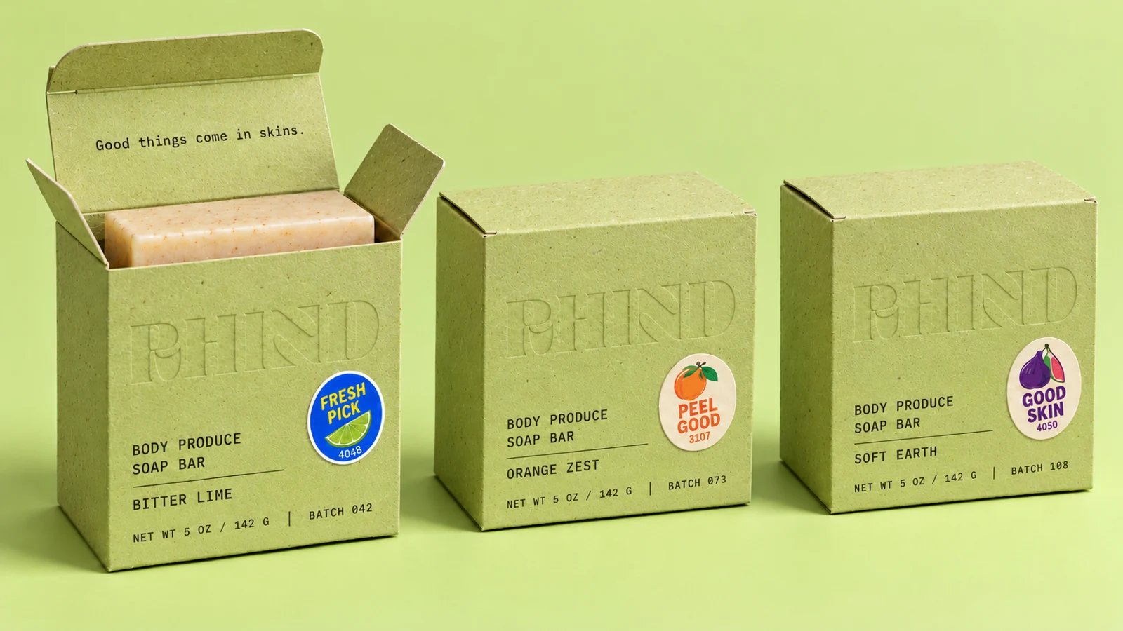
A welcome box can make someone feel cared for. A publication can bring a mission closer. We consider the message, materials, sequence, and visual details together, creating physical touchpoints that feel like a natural expression of your brand.
The work behind it
Every engagement is tailored to the work your brand needs. We agree the deliverables and scope before we begin.
Connect boxes, inserts, labels, and other agreed pieces into a thoughtful experience from the outside in.
Translate your story into publications, brochures, and designed content with a clear visual and reading rhythm.
Carry the identity into business cards, stationery, event materials, and other physical touchpoints your business needs.
In practice
How we work
Leia and Jay stay directly involved, connecting strategy and creative direction throughout the work.
We define who will encounter the piece, what it needs to communicate, and how you want it to feel.
Story, hierarchy, format, and visual direction develop as one connected experience.
We prepare the agreed artwork and coordinate production requirements with your chosen suppliers as scoped.
A few things you might be wondering
Yes. We can extend an established identity into new applications. If the current system has gaps, we will identify those before deciding how to approach the work.
Production costs and supplier responsibilities are confirmed separately in your agreement. We clarify artwork, specifications, and coordination needs before the project begins.
Yes. We can create the initial editorial system and discuss ongoing creative partnership for future issues, campaigns, or collateral.
Services / Ongoing creative partnership
Your brand keeps moving after launch. Stay supported by creative partners who know its story, protect its consistency, and help you show up thoughtfully as the next need arrives.
I want to explore my optionsSouthern California · Partnering worldwide
What becomes possible
The presentation is due. A new campaign is taking shape. Your team needs a brochure, a publication, or a fresh set of social assets. Ongoing creative partnership gives that work a familiar home, with an agreed scope and a shared understanding of what your brand needs to protect as it grows.
The work behind it
Every engagement is tailored to the work your brand needs. We agree the deliverables and scope before we begin.
Presentations, brochures, sales materials, print pieces, and other agreed assets that help your team communicate clearly.
Bring campaign concepts, social templates, email graphics, and digital assets into a consistent visual system.
Support recurring publications, new touchpoints, and the evolution of your brand through a defined creative relationship.
In practice
How we work
Leia and Jay stay directly involved, connecting strategy and creative direction throughout the work.
We understand your existing brand, the work ahead, and the support your team needs most.
Together we define scope, priorities, review points, and a working cadence that fits the engagement.
We design the agreed work, maintain continuity, and revisit priorities as your business develops.
A few things you might be wondering
No. We can begin by reviewing an existing identity and its guidelines to understand what needs to remain consistent and where additional direction may be useful.
No. Deliverables, capacity, timing, and revisions are defined in the agreement. A clear scope helps us give the work the attention it deserves.
Yes. We can discuss the immediate need first and whether a project or ongoing arrangement is the better fit. You do not need to choose the structure before we have spoken.
Vera Creative Partners
Last updated October 17, 2026
Vera Creative Partners uses information you provide through our inquiry and newsletter forms to respond to requests and send the communications you choose to receive.
Inquiries are processed through FormSubmit, and newsletter subscriptions through Kit. Booking links open Google Calendar. These services have their own privacy practices.
If you allow analytics, Google Analytics measures visits and interactions with this website. You can change that choice using Cookie settings in the footer. Please avoid sending sensitive information through website forms.
To ask about your information, request a correction or deletion, or stop receiving communications, email hello@veracreativepartners.com. Newsletter emails also include an unsubscribe link.
Vera Creative Partners
Last updated October 17, 2026
This website introduces Vera Creative Partners and our work. Published offerings and timelines describe our services; the scope, schedule, fees, usage rights, and other terms of an engagement are established in your signed agreement.
Portfolio materials include work created for clients and third-party content. Please contact us before reusing any materials.
External services linked from this site have their own terms and privacy practices.
Payment, cancellation, and refund terms for a project are set out in the signed agreement for that engagement. For questions, email hello@veracreativepartners.com with your project details.


